
A chat about colours
There is no reason to hate teal, but still...

The color wheel I didn’t learn about
I found out very late in life about the famous color wheel.
Back in high school, we had to copy old drawings from the ancient Greeks for one year and do some sort of technical drawings for the remaining four years, without having any idea of what we were doing or why. The truth is, we spent the majority of that hour per week roaming around the school, while our teacher was reading the newspaper and poking his nose. This is a truthful recollection of real events, not a joke I threw in just to make people laugh (I mean, also).
He did literally poke his nose.
We escaped class partially because the view of the old man exploring his nostrils was somewhat disturbing, and partially because we were 15 years old and running up and down through the school felt super exciting and cool. By the end of the five years, his nostrils were spot clean, and we had grown a reputation for being undisciplined kids. None of us knew anything about art or Greek amphoras, let alone colours.
Going back to the colour wheel: it is very useful. Go and look at it.
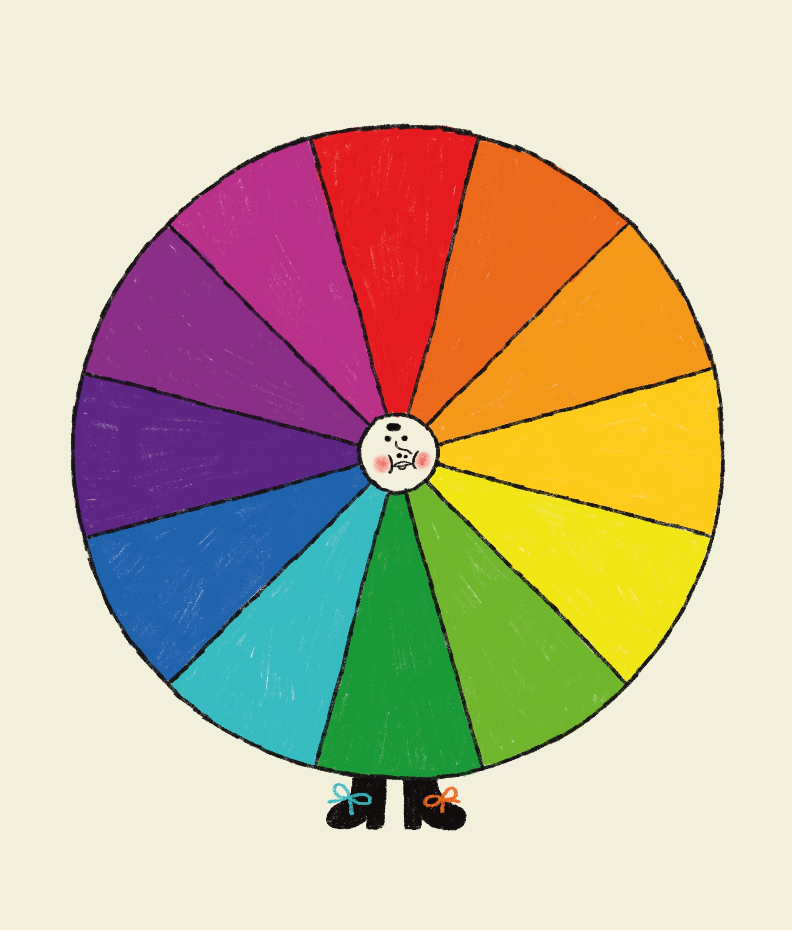
I am art-illiterate and did without it. It was okay-ish. Like walking from A to B through the woods and having to face a wolf or two instead of driving on the highway. You can still get to B, or maybe end up in C or D. Whatever works.
Looking at things
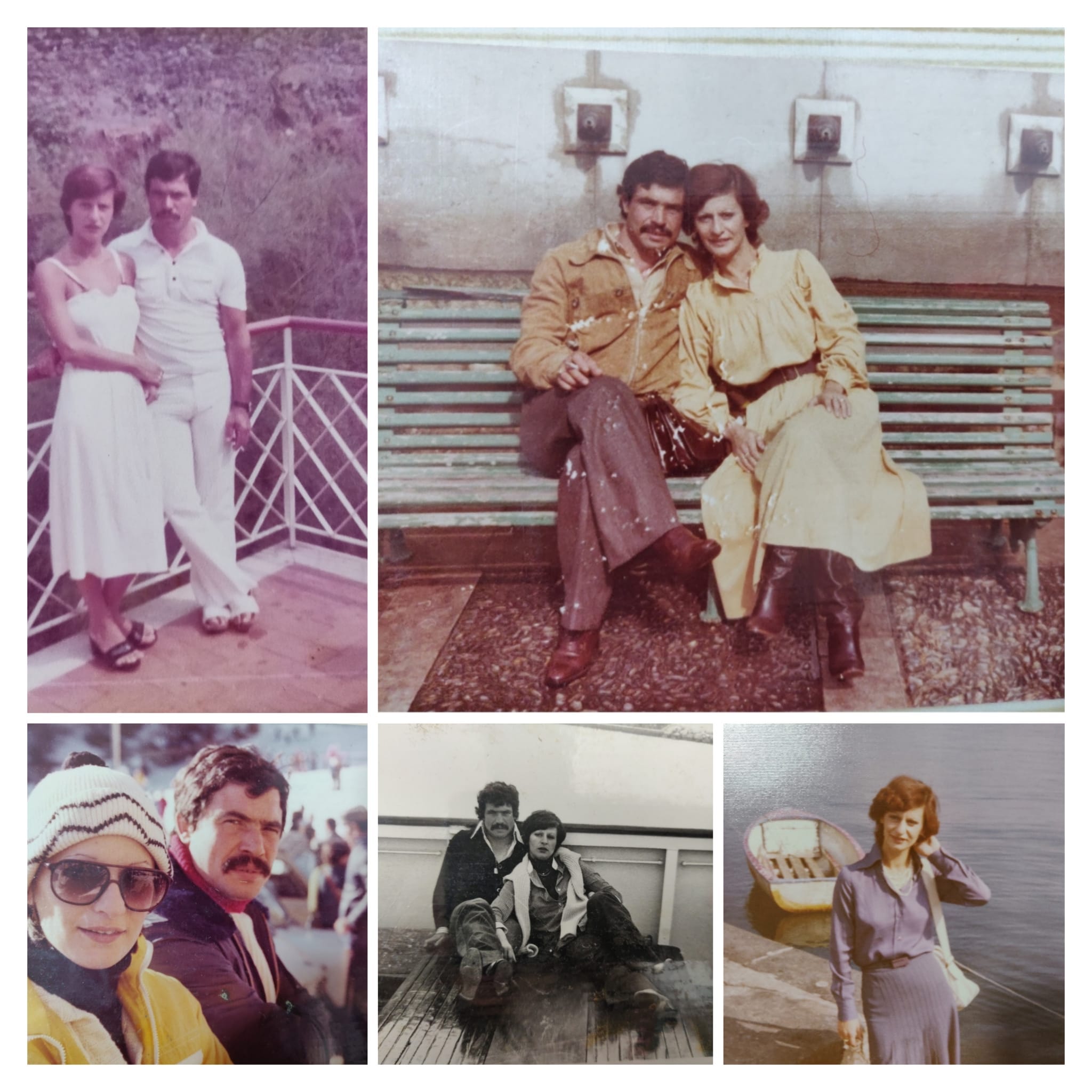
When I was a kid, we didn’t go to museums, read many books, or talk much about art. But my mother was a tailor, and she loved crafts. Both my parents had a great sense of aesthetics. I mean, just look at them.
I mentioned in a previous post that we lived with my aunt and uncle and my cousins (yes, it was busy in-da-house). Did I also mention that my aunt ran a clothing shop in one of the rooms? My sister and I used to spend hours there, looking at clothes and listening to my aunt give customers advice on how to match outfits and follow the latest trends.
My aunt? You’d see her wearing a big apron, frying anything from artichokes to polenta all weekend long, but when she wasn’t in the kitchen, oh my, she was the diva. Always in colourful clothes (she loved pastels and floral patterns), carefully matching shoes and jewellery. My fashion idol.
I think we develop a sense of aesthetics very early in life. What we like is what we have seen and experienced since we were kids. If we learn to look and talk about beauty and colours from an early age, it stays with us. If we keep training it, it becomes a treasure for life.
I’m in constant training mode. I stare at people (sorry, they say it’s an Italian thing and probably it is), animals, things.
I rarely draw from real life, though. I’m not very good at quick sketches. I like to walk around and find things rather than sit and draw things in front of me. I feel that there’s less potential for very good discoveries if you just sit and wait, you know.
My phone is full of notes like “Blue as the sweater of the granny seen in the park”. Also, things like “Cloud head wearing fancy clothes,” “Dog with a puffer jacket,” “Butterfly guy.” Sometimes I wonder what people would think of me if they stole my phone and read my notes. Except no one would ever steal my phone, because I’ve dropped it ten times and it has a broken screen that I don’t bother fixing anymore.
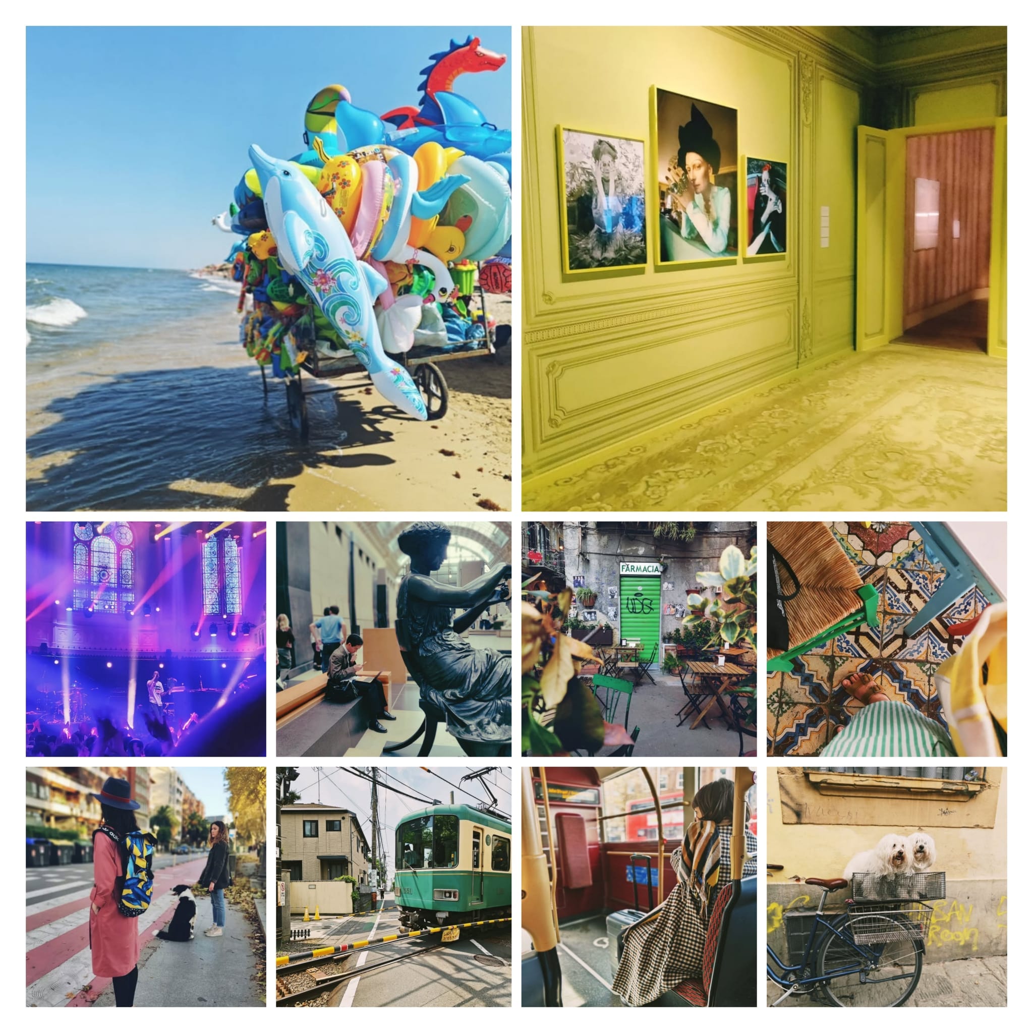
But really, I am constantly looking, taking notes, and taking pictures. I love taking pictures: it’s a way to train my eye to look with intention, a way to capture a moment, a feeling, a colour, a composition.
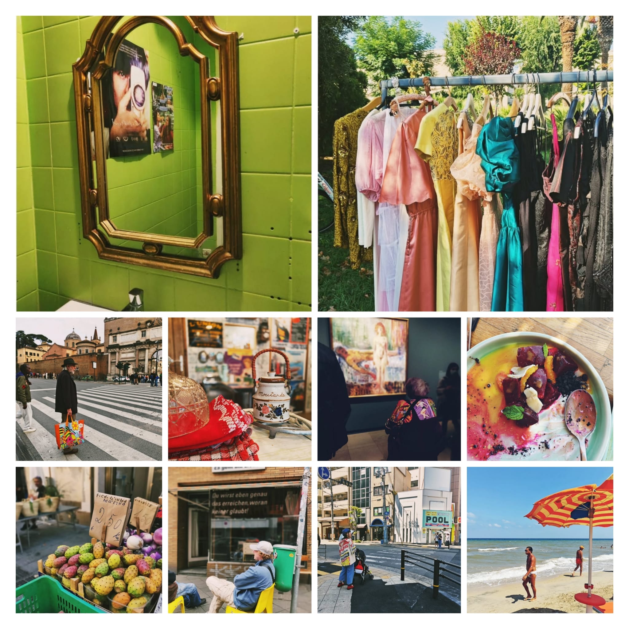
When I take pictures, I make connections between things: interesting shapes and colours, things that match, mismatched things, tiny colourful details that stand out in a muted landscape.
Paintings, movies, design posters and magazines, vintage and modern picture books. You name it.
I am a crazy collector. My phone is packed with pictures. My shelves are filled with books. My Pinterest boards are overflowing with images.
These random collections help me, whether I go back and look at them for inspiration or they just stay in the back of my mind as a training exercise.

Colour choices
Some colours are your very best friends, they feel like home. Others are your worst enemies. They can be truly terrifying.
I’ve heard several people say that “green is difficult,” but I can hardly imagine drawing something without using green. Blue, on the other hand, feels way more intimidating to me, for some reason.
Some colours, like teal, are super annoying. Why would I ever want to use it? (sorry, to the teal lovers out there). I know it is some sort of green and I’ve just said that I love green. But still…
I am definitely drawn to bright, happy, bold colours, and I have a soft spot for retro.
There are so many factors involved when choosing a color palette, and I don’t always follow a straightforward or rational process.
I obviously choose colours to give a certain vibe or feeling. In this illustration, I went for fresh, happy, and vibrant colours for a summer themed poster.

Sometimes, I like unexpected contrasts.
For my upcoming book L’Elefante a mezzanotte (The Midnight Elephant, Camelozampa, February 2026), a delicate and poetic story about an elephant who cannot sleep, I chose very bold, graphic colours. At the time, I was obsessed with a bold palette of primary colours and wanted to experiment. After reading the story (by Italian author Lorenzo Coltellacci), I felt that this palette could give the book an extra edge: make it interesting and modern. I loved the contrast between these bright colours and the overall calm and soft atmosphere of the story. I think it contributed to making it slightly odd and intriguing.
I often already have a palette in mind, somewhere in the back of my head, and then develop work around it, rather than creating work first and asking myself, “Which colours should I use?” Of course, I sometimes develop the palette on the go, after the story and sketches have been made. There isn’t always a clear structure.
In a way there are no rules in choosing colours - as in it’s all about what we like and feel like - but at the same time, there are tons of rules!
The right balance
Have you ever had that feeling: hey, I’ve used all the right colours, but the illustration still feels off?
I mostly use colours intuitively. I don’t worry too much about rules, mostly because I never really studied them, so I’m used to figuring things out as I go. Sometimes I’m lucky, I trust my intuition and it works. Other times, it’s a real fight and several attempts until I get something I’m happy with.
When that fight is on, it is mostly because I haven’t really paid attention to how I was combining those colours on the page. My intuition was telling me big fat lies, or I was distracted and not listening. Or better, not looking.
I think my biggest challenge is that sometimes I don’t do enough color planning or testing in advance.
Choosing colours is one thing, applying colours is a totally different matter. If you don’t take into account contrast and the big rules of light and dark (values were such a big discovery for me!), there’s a good chance your eyes might start twitching because there’s too much going on on the page. Or they might wander across the page confused, with no idea what to look at.
What is your relationship with colours?
Which colours are you drawn to and why? What is your biggest challenge when it comes to colours?
Btw, if I have written this using both the English and American spelling for colour/color, I apologize. Also, I never know which one to use. Maybe both is fine, so everyone’s happy.
Such a great post about colour, Lisa!
I resonate so much when you mentioned the difficulties to achieve the right balance. I always struggle between my personal taste and commercial taste as I've been asked to brighten up my work and use less brown, muddy colours quite often.
And I love your amazing colour choices of L’Elefante a mezzanotte, they remind me of the 60s!
I love the way you write, I felt like we're drinking cofee in a bar and you're telling me this story. Somehow, your writing reminds me of how much I love life. And love the visual storytelling that accompanies it.